Monday, 6 June 2011
Veiwing my Blog
Some posts are not appearing on the feed. Click the titles of the posts on the side of the page from bottom to top to view each post in order.
Thursday, 26 May 2011
Eat 5* Evaluation
The brief of this project was to create a series of photographs of the city of bath, to the specifications of the shop in which they would be displayed. I began by working with Fresh milkshake and smoothie bar, but due to unforeseen circumstances I was required to find a new shop in which to display my images. I found this difficult as I needed to start the whole project again. Luckily I was allowed to join another person in Eat5star, where the requirements were already discussed so I just needed to the guidelines that had already been set. This was the most productive way to continue in the project, however this then limited me to someone else’s ideas instead of my own. The brief et by the shop was to take black and white photography of bath and then inject colour into them to match the walls of the shop. I would have liked to have used film photography and added colour in the way that John Lowings did with his images but this technique is time consuming and expensive so I was limited to using Adobe Photoshop to give the same effect.
Initially I thought it would be easy to take some strong images of bath, but the requirement to add colour was limiting as this required me to think a lot about what I was taking pictures of as I had to think about what I could add colour to. The obvious choice was to take images of trees and grass so this theme is repeated in my final pictures. The image that does not follow this idea is the picture of the pig, which was originally blue. I think that if I had more time to think about what I could take pictures of, the majority of my images would be a successful as the pig. Another requirement within this project was to create an adverting poster which would be displayed in the shop window and featured on the leaflet for the photography trail; Unlike the posters that other people created, we decided not to use one of our images as part of the poster as this could either put people off the show before seeing it if they did not like the image displayed, or ruined the exhibit if we gave too much away. We decided to just create a simple poster placing the information onto a dark background. Framing the images was simple as we did not have frames to work with so were not limited to a certain size. We decided to make all the images A3 as there was a lot of space to fill and I feel that if we made the images any smaller they would be lost among the other work that had been hung on the walls of the shop. Taking the feedback we received into account I feel that if I had to go through the process of putting up a show again I would work closer with the owner of the shop to understand fully what he wanted to achieve from working with us, as visitors felt that the images were not in keeping with the shop. Having a higher budget and more time to create this exhibit I would have taken images at an event that the café holds as I think the owner would be more inclined to permanently display these as they would be more personal. Overall I think the show was a success taking into account the time frame I was required to work to. I think the images were successful and I think they looked strong when displayed. I have been asked to be a photographer at the café’s events and create more work to display on the walls so this shows that the owner also feels my show was successful.
Initially I thought it would be easy to take some strong images of bath, but the requirement to add colour was limiting as this required me to think a lot about what I was taking pictures of as I had to think about what I could add colour to. The obvious choice was to take images of trees and grass so this theme is repeated in my final pictures. The image that does not follow this idea is the picture of the pig, which was originally blue. I think that if I had more time to think about what I could take pictures of, the majority of my images would be a successful as the pig. Another requirement within this project was to create an adverting poster which would be displayed in the shop window and featured on the leaflet for the photography trail; Unlike the posters that other people created, we decided not to use one of our images as part of the poster as this could either put people off the show before seeing it if they did not like the image displayed, or ruined the exhibit if we gave too much away. We decided to just create a simple poster placing the information onto a dark background. Framing the images was simple as we did not have frames to work with so were not limited to a certain size. We decided to make all the images A3 as there was a lot of space to fill and I feel that if we made the images any smaller they would be lost among the other work that had been hung on the walls of the shop. Taking the feedback we received into account I feel that if I had to go through the process of putting up a show again I would work closer with the owner of the shop to understand fully what he wanted to achieve from working with us, as visitors felt that the images were not in keeping with the shop. Having a higher budget and more time to create this exhibit I would have taken images at an event that the café holds as I think the owner would be more inclined to permanently display these as they would be more personal. Overall I think the show was a success taking into account the time frame I was required to work to. I think the images were successful and I think they looked strong when displayed. I have been asked to be a photographer at the café’s events and create more work to display on the walls so this shows that the owner also feels my show was successful.
Visitor questionnaire
I designed a questionnaire for both the manager of the shop and the visitors. The questionnaire asked questions such as "how do you think the images worked with the shop" and "Is there a way to improve the exhibition".

The results are varied but most visitors agreed that the images were strong but were not in keeping with the shop. The way in which the visitors felt that the show could be improved is to have used images of food as apposed to Bath which we were briefed.

The results are varied but most visitors agreed that the images were strong but were not in keeping with the shop. The way in which the visitors felt that the show could be improved is to have used images of food as apposed to Bath which we were briefed.
Business Questionnaire
I created a business questionaire for the manager of Eat5Star to fill out. This questionaire differs from the visitors questionaire as it asked about previous work with other students and what changes they would make if they had to work with us again.

I am pleased with the results as the manager seemed impressed my our timekeeping and the overall work.

I am pleased with the results as the manager seemed impressed my our timekeeping and the overall work.
Eat 5* Final
When it came to displaying the images in the shop, we were able to do this with great ease as we were not required to mount our images in frames and the sizes of the images needed was not specified. We printed all our images off onto A3 paper and mounted them using foamboard. The images are stuck up using Velcro so no holes were made in the walls of the cafe.


Saturday, 21 May 2011
Press release and Poster
Charlie Williams and Kate Howes are students from the City of Bath College. They have been studying photography for two years in both film and digital. As part of project they are required to collaborate with a local business and set up an art exhibition in the premises.
Using a mixture of digital and film photography, Charlie and Kate have set up a show in a cafe in Kings mead Square, called Eat5*. The work displayed shows black and white atmospheric pictures of bath, with digital manipulation that allows the images to be in keeping with the decor of the cafe.

Using a mixture of digital and film photography, Charlie and Kate have set up a show in a cafe in Kings mead Square, called Eat5*. The work displayed shows black and white atmospheric pictures of bath, with digital manipulation that allows the images to be in keeping with the decor of the cafe.

Final Prints
These are the final images to be displayed in Eat5*
I am happy with the results of the images as i feel they fit the brief.
Some last minute editing will be done to the images to get rid of the negative scratches.


I am happy with the results of the images as i feel they fit the brief.
Some last minute editing will be done to the images to get rid of the negative scratches.


Friday, 20 May 2011
Cork Photography
I spent a lot of time capturing different areas of bath using black and white film. I tried to go to places that nobody else would go, as i did not want a typical image of something like the abbey or the circus, as I knew these would be used multiple times in other peoples images. I went to places such as the Botanical Gardens and tried to focus on less obvious elements such as the nature, as I know buildings would be the main subject throughout the competition. After taking my photographs and developing my film int he dark room I had to decide on what images would work best. By creating a contact sheet using the negatives i could see all the images in small to select which ones I think worked best. My three favorite pictures were of a tree in the Botanical Gardens, a shot of the weir next to the Parade, and a shot of a secluded area of houses near the Abbey. I was selected to fill a frame that was 1m in width, however I felt that my images worked better at a smaller size after experimenting with different sized sheets of photographic paper. I found it hard to select one of the three top images do i decided to select two images that juxtaposed together; I felt that these two images would show two different sides of bath.
Cork
As part of this project we are required to take a photograph using a film camera and print it ourselves in the dark room. This photograph will then be displayed in a local bar along with many others from the class as part of an exhibition. We are going to get judged on our photographs as part of a competition and the winner's image will be displayed on a large scale within the bar. The image must be of bath and we will be allocated frames to display them in so required to print these images to the size required. I think that using only film photography in this project is a good idea as i feel the images will have a more personal look as there is more effort put in to developing and printing these pictures so we will be judged on more than just photography skills.
John Lowings
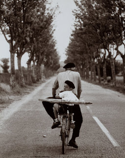
John Lowings is a successful photographer who published a book of poetry with his photography. He came in to talk to us about how he began in photography and the stages he took to create the book. He also talked us through his photographs and the story behind them. His work is mainly black and white photography of landscapes in Ireland. He used 35mm film for most of his work and developed them by hand, using a DSLR camera did not appeal to Lowings when they became popular so he stuck to what he knew. He discussed the problems that he encountered by just using film, such as the fact there is only a limited amount of shots on a film so he had to be very aware of what he was taking an image of. The most important piece of equipment that he uses is a tripod, as he could not risk the image being shakey because of the limited amount of pictures he could take. This is also important as he takes many of his images during the night which involves a slow shutter speed which could result in camera shake if not stable. In my opinion i prefer the images that have been used in the book of the landscapes, as the more recent images of buildings and train lines are not as emotional and have less of a story behind them. He used colored inks on some of his images in inject colour into certain elements such as flowers. I was unaware of this technique and i think it worked well with his images but i still prefer his moody images of the sea and the land. He has not named his photography so addresses them by the date and location they were taken.
This image of farmers land by the sea was my favorite image. I did not understand it at first but when Lowings explained the meaning behind the photograph, pointed out small details and explained the effort put into capturing the image, I understood the composition.

The main reason John Lowings came to talk to us is to explain how he goes about exhibiting his work. He explained that funding was the most important procedure in creating an exhibit and gave us ideas as to how to hold a successful exhibition on a small amount of money by borrowing from shops in exchange for advertising their company.
This image of farmers land by the sea was my favorite image. I did not understand it at first but when Lowings explained the meaning behind the photograph, pointed out small details and explained the effort put into capturing the image, I understood the composition.
The main reason John Lowings came to talk to us is to explain how he goes about exhibiting his work. He explained that funding was the most important procedure in creating an exhibit and gave us ideas as to how to hold a successful exhibition on a small amount of money by borrowing from shops in exchange for advertising their company.
Initial Photos
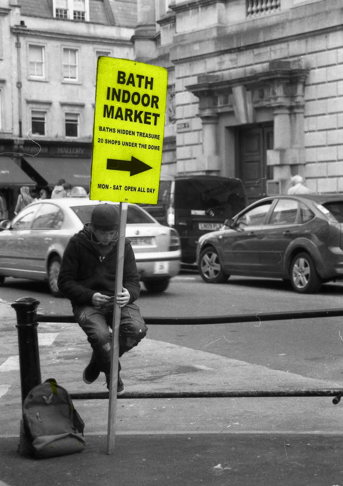
As our brief for Eat 5* was to take black and white images of bath, and then use photo editing software to make an item green, i first had to find possible locations and items to take photographs on that contained green in them. I began by taking images of trees and leaves hoping that i would be able to include the company colour within them. This worked quite well as i could put in areas of the lime green required within the original colour of the trees, as making them all bright green would look ridiculous. I feel that the image of the pig works the best as it follows the brief and also advertises bath as the pig statues are a well known part of bath. I created these images by using a combination of techniques.I created the ones with natural elements in them by using the colour replace tool, and used the mask tool to create the pig. I feel that the mask tool would not have worked on the trees as it would have made them look too flat, whereas this technique worked when coloring the pig as it is a flat base paint on the pig anyway so did not require any added depth.
This is the contact sheet for my 5 final prints. Along with Kate's prints we will have 10 images to display.

This is the contact sheet for my 5 final prints. Along with Kate's prints we will have 10 images to display.

Target audeince
I am required to research the target audience for my show. I asked the manager of my shop the usual age groups of visitors to the shop, which he answered between 21-40. I feel that it will be easy to create photographs that would be appealing to this target audience as I do not feel that age is a concern when exhibiting photographs. He also told me that the visitors to his shop are usually women so I need to take this into account when taking my images as I feel that women and men have different perceptions of photography.
Eat 5*
Unfortunatley I am unable to work with Fresh as the shop had closed down. This has left me with a limited amount of time left so I have to join another person working in a shop as I do not have time to plan the images again.
The shop that i have been designated is a small cafe in Kingsmead Square called Eat5star. I went to a meeting with the owner to discuss possible ideas and safety risks when setting up and holding our exhibition.


These are images of the work space in which we can use. We are unable to remove the existing images from the wall but there is plenty of space to work around them. We are not required to frame our images so the sizes and layout is up to us.


The shop that i have been designated is a small cafe in Kingsmead Square called Eat5star. I went to a meeting with the owner to discuss possible ideas and safety risks when setting up and holding our exhibition.
These are images of the work space in which we can use. We are unable to remove the existing images from the wall but there is plenty of space to work around them. We are not required to frame our images so the sizes and layout is up to us.
Fresh
We were required to find a shop that would be willing to display our work. We are going to advertise our exhibit by creating a 'photography trail' which would include all the participating shops logos on a map, which would be handed out during the Bath fringe festival. 'Fresh' cafe have expressed an interest in displaying my work in their store so i attended a meeting with the owner to discuss possible ideas. We discussed the space available and decided on 10 images that I would be required to frame myself.
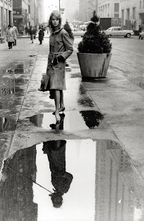
Karen Jones seemed keen on the idea of portraits to be displayed on the walls of her shop so I experimented with both digital and film photography in the town center to take photographs of performers and other people.
This is one of a series of images that I have taken, which could be used in my shop. I feel that taking images of random people in town would look more authentic than if i used models in a studio, and be more appropriate as it would also be adverting the area.
Thursday, 19 May 2011
Photographers
David Bailey
David bailey is a British fashion photographer for Vogue magazine. His work is digital and usually has a high contrast. He explains that he does not think it is important weather you sue digital or film as it is the person who takes the image and it does not matter about the format. This image was taken using a film camera which is clear by the dull and grainy texture. I think the content is strong and interesting, and it is different to the majority of his other images as it is not taken in a studio.
Elliott Erwitt
Elliot Erwitt is a photographer for advertising and documentaries. His work usually contains unusual content taken in every day life. He used film throughout his career even when digital photography became more popular, as he felt that digital photography would never capture the emotions of the place or the person as well as film. This image was taken using 35mm film and the implied motion of the image is strong. Erwitt has composed this image well as he has left space at the top of the image to allow you to imagine the subject riding into the distance. There is not a lot of contrast in the image which i think works well as it gives the image a natural feel.
Robert Frank
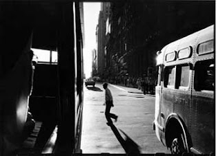
Robert Frank used film photography to create hand made books throughout his early life, but then turned to digital photography when he moved to America and became a fashion photographer for Harper's Bazaar. He turned back to film photography after that and created collages using multiple negatives, scratching words in them and distorting them before exposure. I think this image is strong as you can tell that Frank took it from inside a bus. I am unsure about which format this image was taken but i assume it is was using film because of the grainy texture and the blur of the persons foot running through the center. The image has lot of contrast so a filter must have been used when exposing the image.
Maurizio Polese

Maurizio Polese used digital photography to capture landscapes. His work is very high contrast and strongly edited. I think the fact that this image is taken in digital is very obvious as you can tell he has added a lot of contrast to the image and also added a light source effect in the middle, which is consistent throughout all his images. I think this piece is strong and eerie, which could not be recreated using film in the same way.

David bailey is a British fashion photographer for Vogue magazine. His work is digital and usually has a high contrast. He explains that he does not think it is important weather you sue digital or film as it is the person who takes the image and it does not matter about the format. This image was taken using a film camera which is clear by the dull and grainy texture. I think the content is strong and interesting, and it is different to the majority of his other images as it is not taken in a studio.
Elliott Erwitt

Elliot Erwitt is a photographer for advertising and documentaries. His work usually contains unusual content taken in every day life. He used film throughout his career even when digital photography became more popular, as he felt that digital photography would never capture the emotions of the place or the person as well as film. This image was taken using 35mm film and the implied motion of the image is strong. Erwitt has composed this image well as he has left space at the top of the image to allow you to imagine the subject riding into the distance. There is not a lot of contrast in the image which i think works well as it gives the image a natural feel.
Robert Frank

Robert Frank used film photography to create hand made books throughout his early life, but then turned to digital photography when he moved to America and became a fashion photographer for Harper's Bazaar. He turned back to film photography after that and created collages using multiple negatives, scratching words in them and distorting them before exposure. I think this image is strong as you can tell that Frank took it from inside a bus. I am unsure about which format this image was taken but i assume it is was using film because of the grainy texture and the blur of the persons foot running through the center. The image has lot of contrast so a filter must have been used when exposing the image.
Maurizio Polese
Maurizio Polese used digital photography to capture landscapes. His work is very high contrast and strongly edited. I think the fact that this image is taken in digital is very obvious as you can tell he has added a lot of contrast to the image and also added a light source effect in the middle, which is consistent throughout all his images. I think this piece is strong and eerie, which could not be recreated using film in the same way.
Tuesday, 17 May 2011
Roman Baths
We visited the Roman Baths twice during this project, firstly to walk around the exhibit and take images of how work was displayed and secondly to discuss how they go about displaying the work. Information and work was displayed in many different ways in the exhibit, such as:
- Perspex cabinets with shelving
- Perspex flooring with mummy's or spa water underneath
- Interactive touch screens and pulleys
- Life size statues
- Projections of people
Projectors were used throughout the museum to show what people would be doing around the spas, and also on the walls to display large scale objects or images.
I attended a meeting with the curator of the Roman Baths to talk about some of the temporary displays they hold in the museum. We discussed the costs of creating a display, and how to work around paying a lot of money for them, such has borrowing items to put inside or recreating articles and items yourself. Susan Fox also talked about previous exhibitions they had held and how they overcame problems they had encountered, and also how the events were funded and advertised. The group was then given items in pairs and we had to discuss how we would display the items if we had to display them in our show. Space was a large topic we covered and i felt this would be helpful as many shops have a small amount of room to display my work.
Saachi Gallery
We visited the Saatchi Gallery in London in 2010. The gallery opened in 1985 and displays a mixture of both traditional and modern art. The space within each room in the museum is fluent throughout; White walls, grey floor and two or three images, statues or cabinets placed separately around them. I think the way they have decided not to cram lots of work in one room is strong as you are able to look at each piece individually and you are able to appreciate the work without clutter or advertisements. The ways in which work is displayed within the gallery is very unique. Some rooms have one large item hanging from the ceieling and others would hold just a pool of oil to create an illusion.
The work within the museum is strong and interesting, the small placards of information don’t distract you from the work, nor explain much about each piece so your perception of the images is left unquestioned. My favourite piece in the gallery was named ‘swarm’ which was displayed on a standing cabinet in the middle of a room accompanying work along the same theme by Jonathan Waterbridge. The piece contains many real insects hung from invisible string, with tiny model people riding on them. I think the piece is very unique and I have never seen anything similar before.


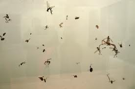

The work within the museum is strong and interesting, the small placards of information don’t distract you from the work, nor explain much about each piece so your perception of the images is left unquestioned. My favourite piece in the gallery was named ‘swarm’ which was displayed on a standing cabinet in the middle of a room accompanying work along the same theme by Jonathan Waterbridge. The piece contains many real insects hung from invisible string, with tiny model people riding on them. I think the piece is very unique and I have never seen anything similar before.

Peggy Guggenheim
When in Venice i attended an exhibition in the Peggy Guggenheim museum. It contained both permanent and temporary exhibitions from many different artists. I was required to focus on the layout of the show and how the event was advertised. This is a map i created of the layout of one of the permanent exhibitions that was held in the museum.


Under a monkey
Under a Monkey was an art exhibition that was conducted by the college every year, which allows students to display and sell their work for up to £500. My class and I were required to help with the exhibition from setting up the area and displaying the work, to helping out and documenting the event.
Show
I must hold an exhibition of my work in a local shop in bath. We are working in conjunction with Bath Fringe Festival by holding our exhibition at the same time and handing out maps with the locations of the classes separate shows. I have handed out letters to many possible locations for my show including Shakeaway, Vintage to Vogue and many coffee shops. I am going to display my photography within the shop in a way that the owners want them, which may be in frames that they can display permanently, or on foam boards so the display can be removed after the exhibition. A way that i have dried to attract shop owners to allow me to display my photography is to point out that advertising my exhibition will automatically advertise their business and will bring in potential customers.
What genre/ style/ theme of photography will you be producing for the show project?
I will be producing a series of black and white photographers for both of my clients. My personal client, Fresh, require 6-10 black and white portraits using digital photography. These pieces must be modern and fit in with the décor of the shop. My second client, The Cork, require 1 print of the city of bath, using manual photography and dark room techniques. The size of this piece depends on the size frame I am selected to fill.
What research will you conduct to start off your project?
I will research photographers in both film and digital photography, specializing in producing black and white images. I will also research other shows and write up any information on shows I have attended.
What camera techniques will you be using?
I will be using both digital and traditional film photography for this project. Each client requires a different technique but I will experiment with both techniques with both clients
What editing techniques will you be using?
For digital photography I will be able to use Photoshop to alter the images. When creating my piece for The Cork, I will be able to experiment with filters to edit my print.
What size/ shape will the final images be?
The size of my one piece for the cork is dependent on the frame I am selected to fill. My pieces for Fresh can be a size of my choice. I am going to produce them in a4-a3 depending on the frames, as there is a lot of space to fill.
How will the final images be presented?
My work with Fresh will be displayed on their wall during the Bath Fringe Festival. It will be advertised by being pointed out on a map that will be handed out, that will include other members in the class’s locations. My piece for The Cork will be displayed in a frame somewhere in the restaurant, and will be viewed during an organised night.
Subscribe to:
Posts (Atom)